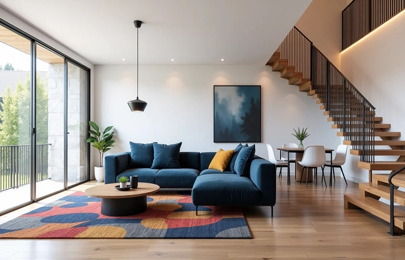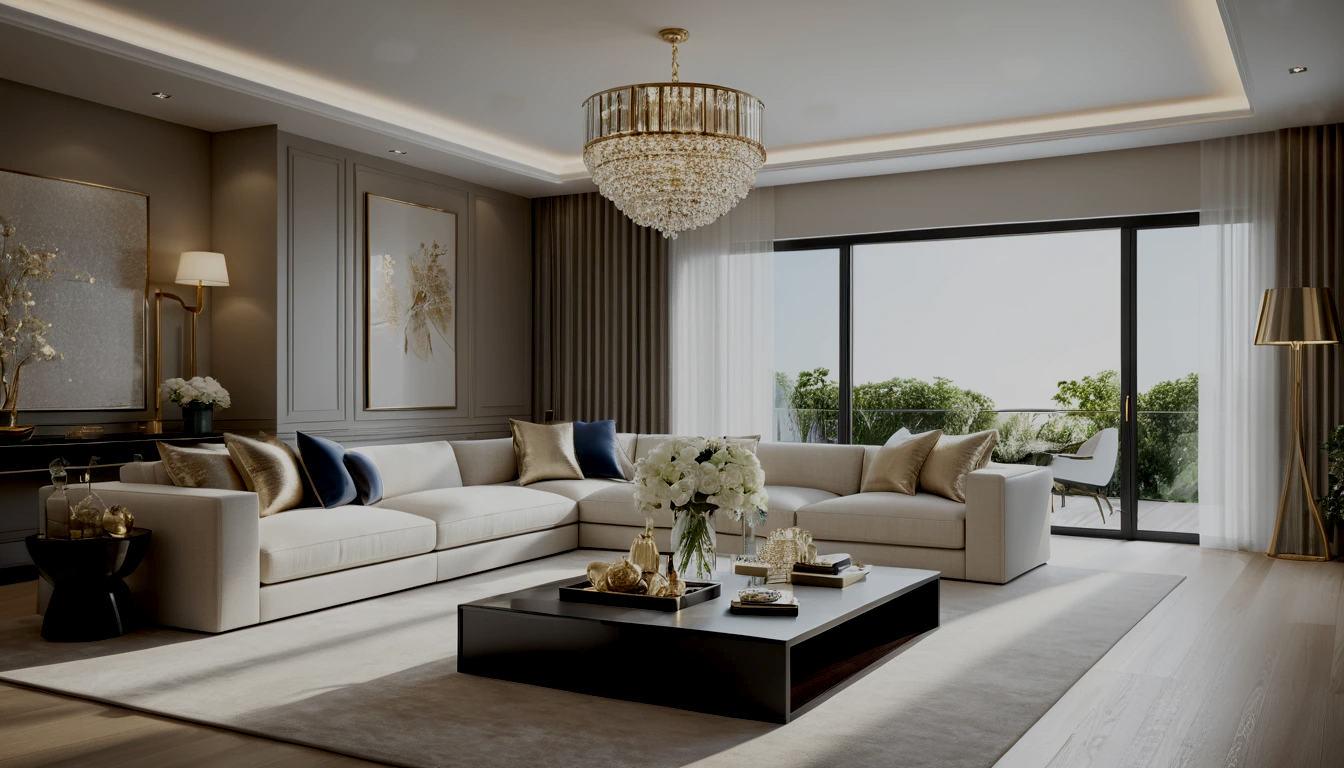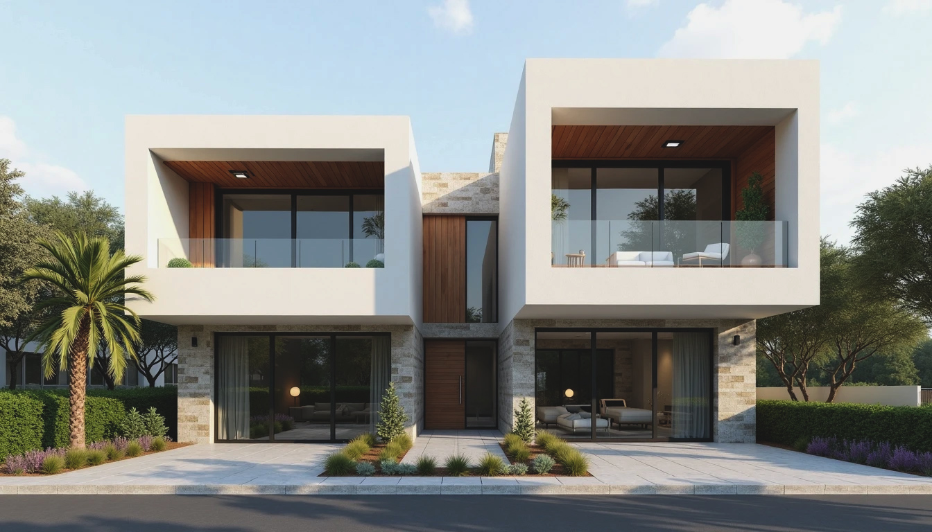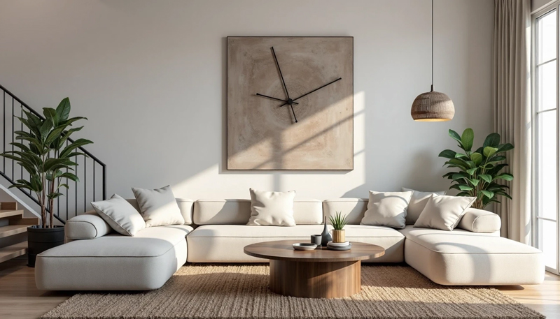
Every interior begins with a layout, but a great layout begins with people. We start by mapping daily rituals: where morning coffee happens, where kids do homework, where guests linger at the end of a long dinner. From there we sketch circulation paths, define zones of activity and quiet, and shape volumes that support the way a family actually lives rather than the way a magazine spread suggests they should.
The oldest tool in the architect's kit is still the bubble diagram. Before a single wall is drawn, we cluster program by adjacency, privacy gradient, and access to daylight. Public rooms hug the sun; sleeping quarters retreat from the street; service spaces buffer noise between the two. When this diagram is right, the plan almost draws itself.
In CAD we test three to five layout options against solar orientation, prevailing wind, view corridors, and furniture proportions. We overlay circulation heat maps to spot pinch points before framing is committed, and we design with the 90/60/45 rule: primary paths at 90 cm, secondary at 60 cm, transitional at 45 cm. Anything tighter reads as a corridor even when it is not.
The result is a plan that maximizes usable square footage without ever feeling crowded. For anyone digging deeper into architecture, we recommend studying Christopher Alexander's pattern language, Robin Evans on figures and doors, and the plans of Adolf Loos, whose Raumplan proved that a great layout is a section as much as a plan.